p3 ~ dialectic 🗣️
prompt ✏️
our past two projects have almost exclusively engaged with form.
you learn how to use new technologies (type design, web programming) and then work within technical limitations to create something of interest.
in this third project, we’re going to do that one more time. but, now we’re going to add nuance and meaning to our work beyond just what it looks like.
here’s our new process:
type + code = dialectic
this project is inspired by an article designer olivia king wrote in 2020 called “a font for the people”↗. in it, olivia talks about how a client wanted a custom typeface but could not afford the licensing fees or design costs. so, olivia came up with the idea of remixing an existing open-source (i.e. free to use and modify) typeface.
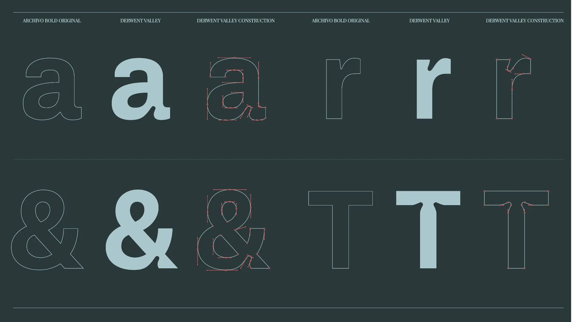
this project emerged out a practical business need, but we can appropriate the same process for creative reasons. what if we remixed an existing font to give it deeper meaning?
this is exactly what risd alum jenni surasky did with their variable font dm serif kudzu↗.
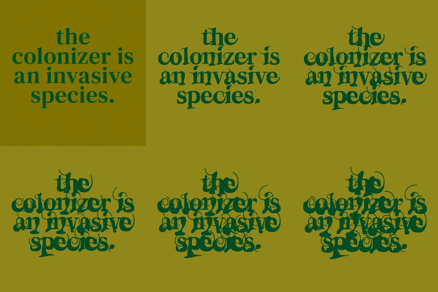
the font can be used to add emphasis within a piece of text. in this case, calling out colonizing countries.
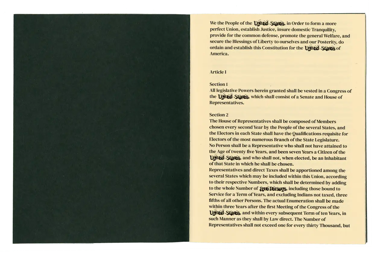
or, to transition the full text to complete illegibility, symbolizing a complete takeover by colonizers.
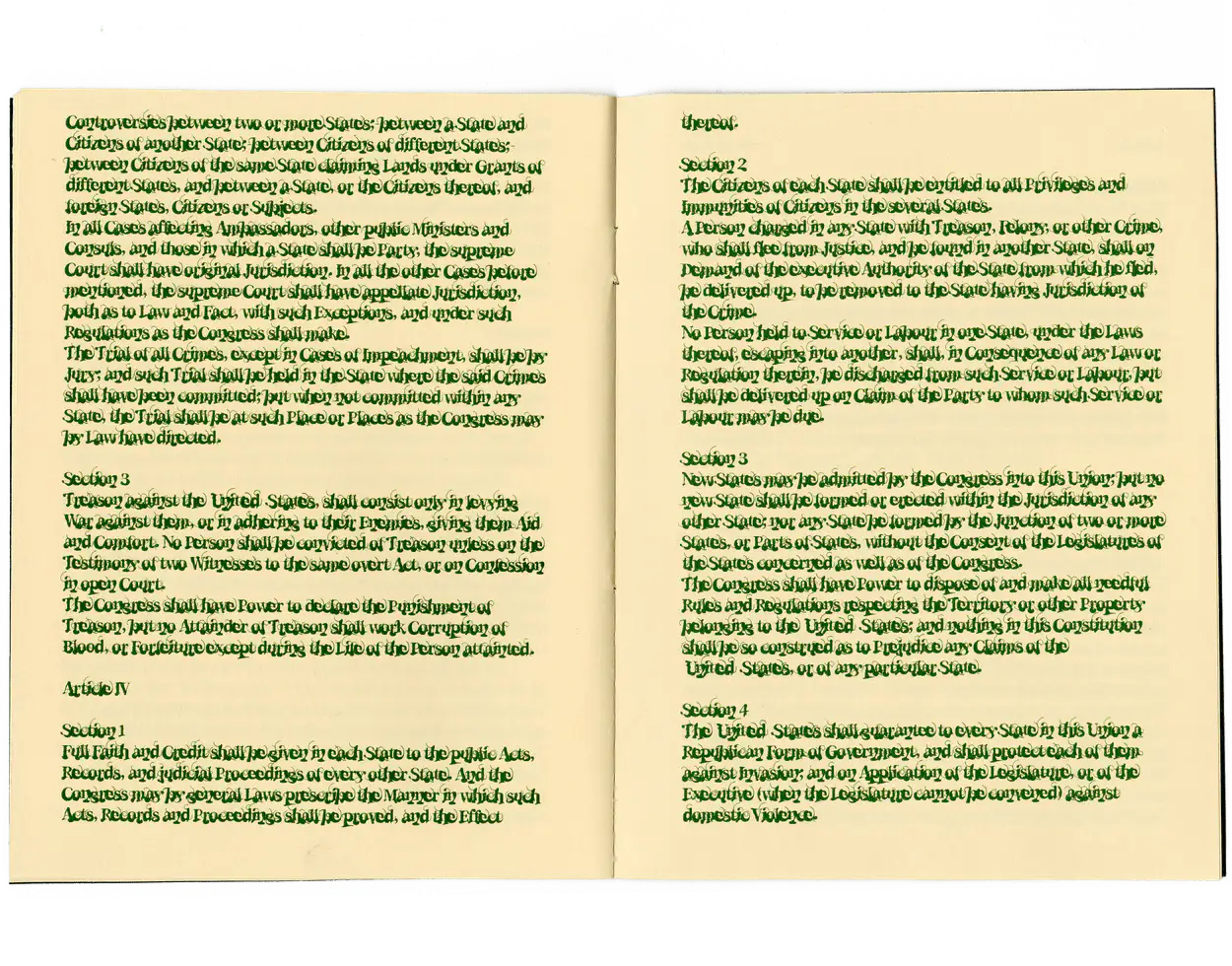
in practical terms, the process of remixing an open-source font makes it much easier for us to transition from atypical type design (pixel and component fonts) to more traditional type design practices.
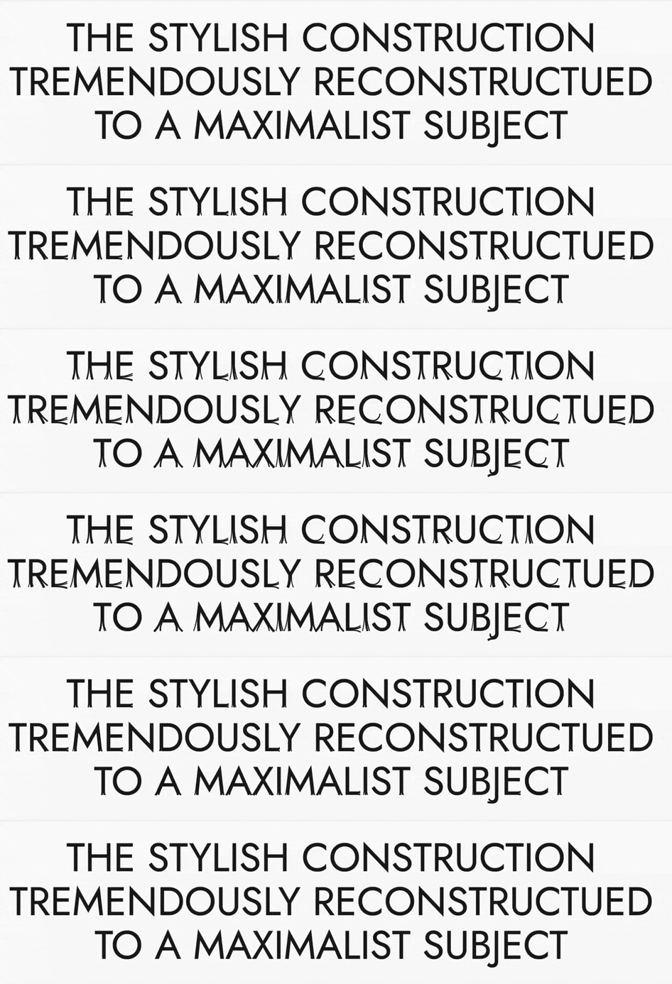
for example, here is the font jost*↗ by indestructible type. except, this version was remixed by risd alum michelle belgrod to add “split ends.” michelle completed this remix in just 2 weeks.
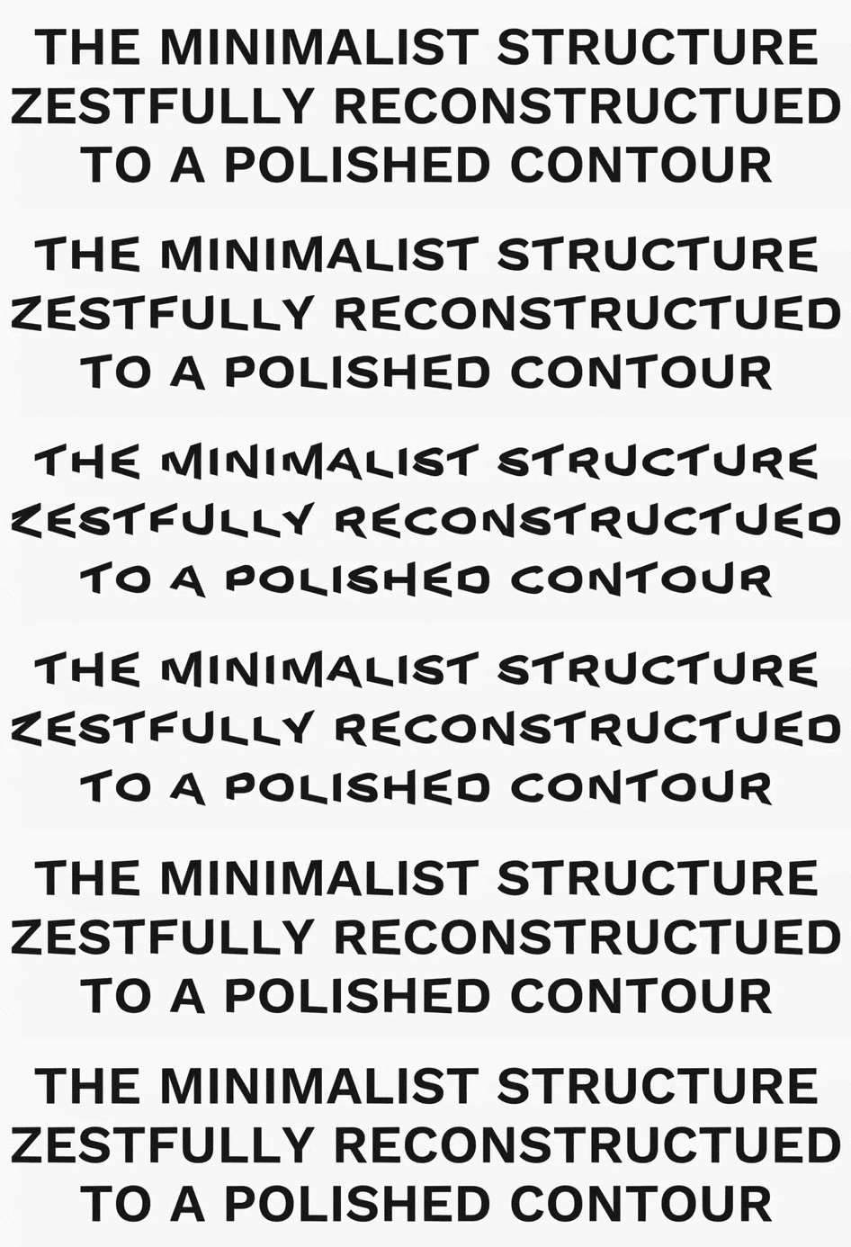
another example: ryan hsiao’s remixed version of work sans↗ by wei huang. in this case, the font is given two variable axes that let it ask as a sort of “megaphone” in either direction left or right (just one axis is shown here).
in my own work, i’ve used this process both for clients and also just for fun.
- →a remixed version of ft88↗ (originally by ange degheest) for the risd grad show 2024.
- →a remixed version of avara↗ (originally by a bunch of people↗), also for the grad show (but ultimately scrapped).
- →another remixed version of work sans↗ for a speculative branding project i did.
technical requirements ⚙️
font 🔠
create a remixed open-source font in glyphs. start by selecting a font to remix from one of the following sources:
- →
- →
- →
- →
- →anything else, as long as the font has an sil open font license (ofl)
your font needs to contain the following:
- →uppercase letters
A–Z - →lowercase letters
a–z - →numerals
0–9 - →punctuation
.,:;!?*#/\-_"'“”‘’@&|$=><~^%()[] - →at least one variable axis
- →use a meaningful name and code for your variable axis ~ this axis should relate to the article you’ve selected!
- →change at least 36 glyphs total in your second font master ~ you decide which ones to change!
- →
- →at least two total font masters
website 🌐
create an animated or interactive digital article using your remixed open-source font. your website should make use of each of the following CSS features at least once:
- →flexbox via
display: flex - →css grid via
display: grid - →some form of activation for your variable font, whether through hover states, keyframed animations, or media queries
for the content of your website, pick one of the following articles or select your own from online:
- →a handmade web↗ by j. r. carpenter
- →typeface as programme↗ by jürg lehni
- →designing friction↗ by luna maurer and roel wouters
- →
code your website either in demoland↗ or visual studio code↗.
publish your website via github pages↗.
the use of ai is not permitted for this assignment and will result in automatic failure.
🚨 JAVASCRIPT IS NOT ALLOWED FOR THIS PROJECT!! 🚨
creative challenges 🎨
establish meaning through a variable axis. 💡
your variable axis should not be about aesthetics alone. instead, it should provide deeper meaning to your selected text.
- →how does the original font relate to your article?
- →how do your variable axis name and code add meaning to your article?
- →how does the font’s transformation add meaning?
- →which glyphs did you choose to transform, and why?
- →how do the in-between states relate to this meaning?
reinforce that meaning through your use of that axis. 📖
typeset your article using your font, and use your variable axis to reinforce or complicate the article’s meaning.
- →when and where do you use the variable axis?
- →frequently or infrequently?
- →at the beginning, middle, end?
- →always, or just sometimes?
- →
- →how do you introduce the variable axis?
- →is it interactive, or automatic?
- →is it disruptive, or subtle?
- →
grading 💯
this project is worth 20% of your grade, so it’s graded out of 20 possible points. here’s how that breaks down:
| category | points | assessment |
|---|---|---|
| font completion | 5 |
|
| website completion | 5 |
|
| critical review | 10 |
|
timeline ⏳
project kickoff
font due
🚫 advising days, no classes
website due, 🏆 crit!
revisions due